
Portfolio / Petal Palette
Petal Palette is a self-initiated UX case study about improving a user's online flower shopping experience. In this, I talk about specific issues that I have encountered in real-life while placing orders for flowers, and introduce some features that may tackle these inconveniences.


Flower shopping has become such an interesting experience, because now there is a type to cater to almost everyone's preferences.
I love gifting flowers, and skilled at picking out beautiful bouquets that I know my recipients would love. But my knowledge about flowers is a different story — you could even say it is the main reason why I take too long to actually place an order. And it does not help that when I visit a new flower store online, their website navigation bar looks something like this:

I also realised that although gifting flowers is relatively personal, very few stores offer an option to customize your own arrangement. After all, since many online stores require a user to create an account, I thought, "Why not leverage on this to make customizations possible?"
How might we help customers choose flowers more confidently and efficiently?
I wireframed a simple flower guide for an online flower shop website.


How might we allow customers to personalize their flower orders?
I also wireframed a simple customization page for the website.


I reached out to a few people in my social circle to test out my simple prototype as I wanted some feedback about the abovementioned features. To my pleasant surprise, I received a number of constructive comments about how I could improve them and fix areas that I overlooked.


Following up with the valuable feedback, I created second wireframe iterations for the flower shop features. Here are before and after comparisons with changes written in bullet points below:


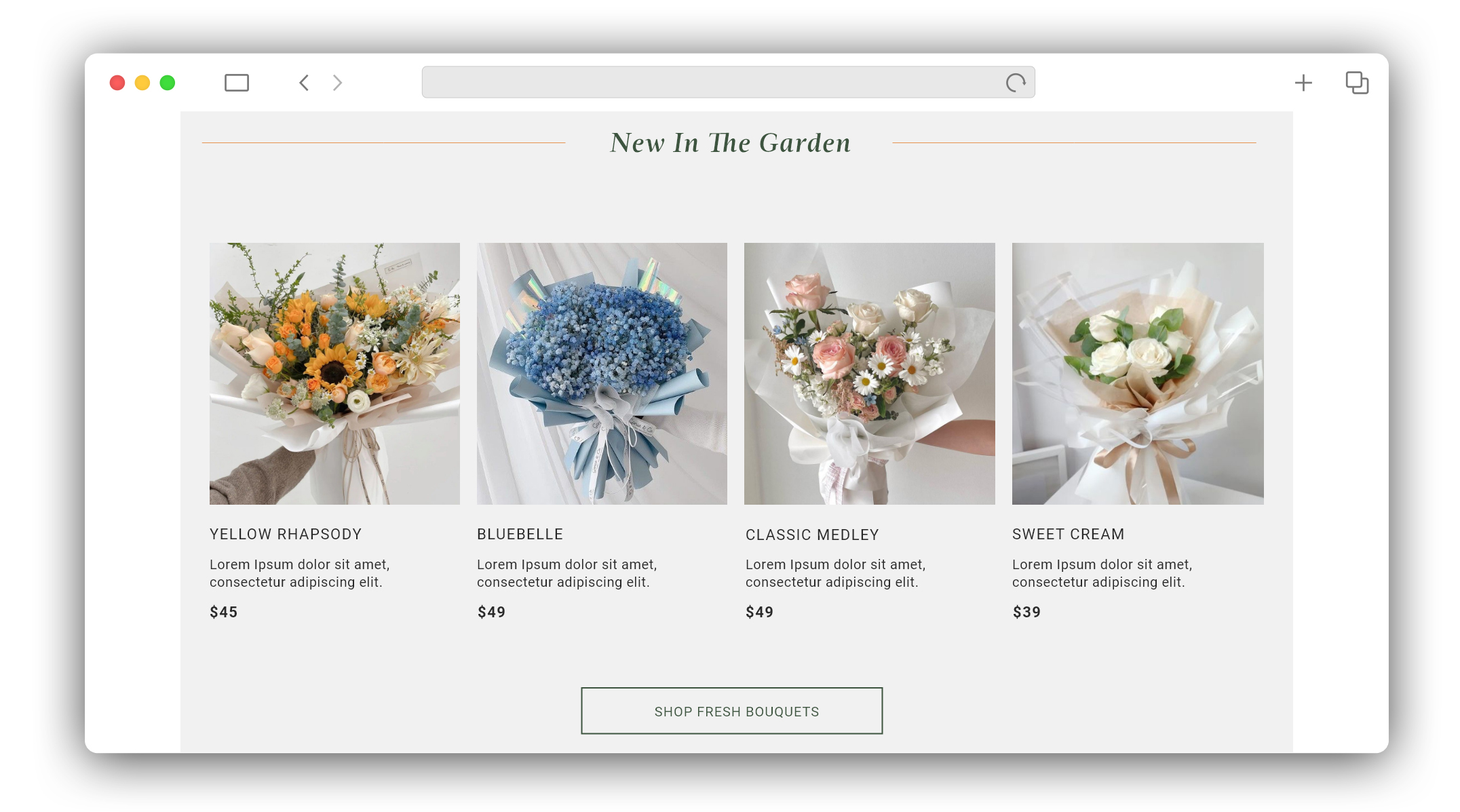
I designed some high-fidelity mockups with real images of flower arrangements, fonts and colours to mimic what the online flower shop could look like embodying the features.


This case study was done almost a year ago. Revisiting it has opened my eyes to new areas of improvement on how I would design differently to further improve user experience.

This case study, although self-initiated, has brought about many learning points for myself, especially how usability testing is a powerful tool to upgrade designs for optimal user experiences. On top of that, projects like this automatically creates a platform for myself to exercise creative freedom, and to learn or sharpen UI skills on tools like Figma and Adobe XD.


